Festival

For my third project of the second year, we had to redesign an existing festival. We could choose from a list of festival.

I decided to go with ‘Kwaku Festival’ because of its rich cultural background en diversity.

Research: Kwaku

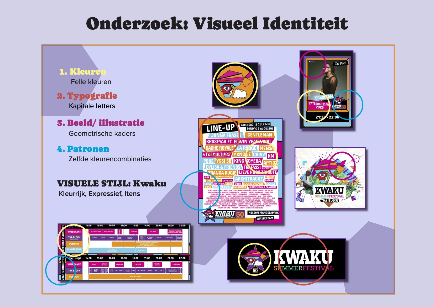
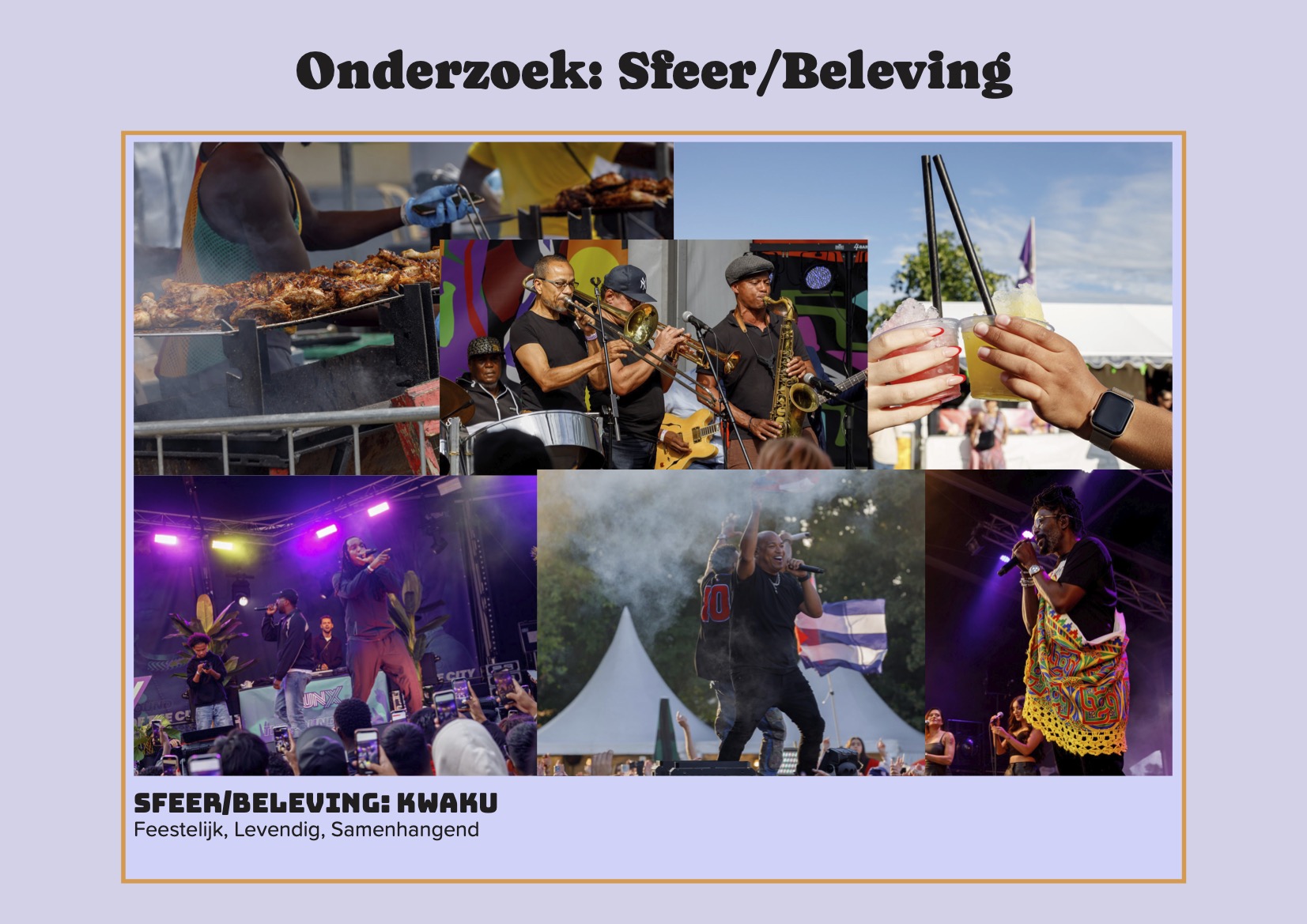
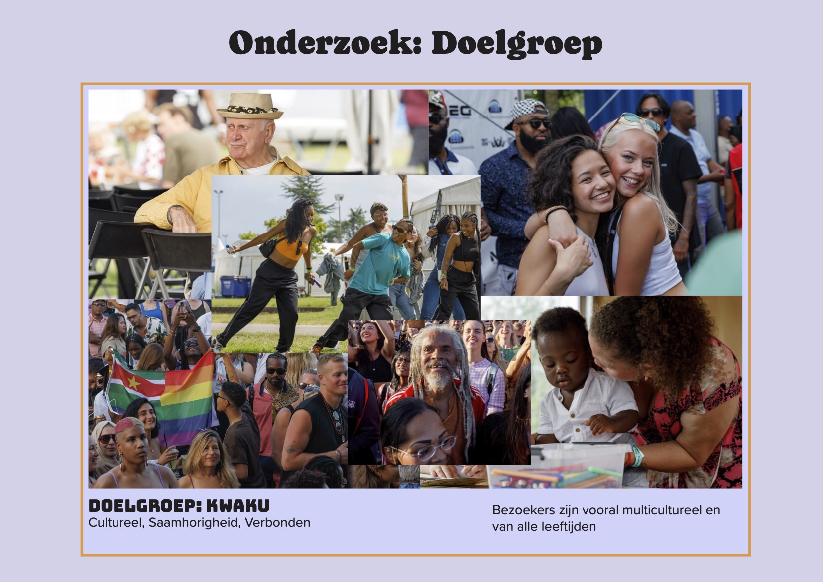
Before starting the design process, I researched the festival itself.
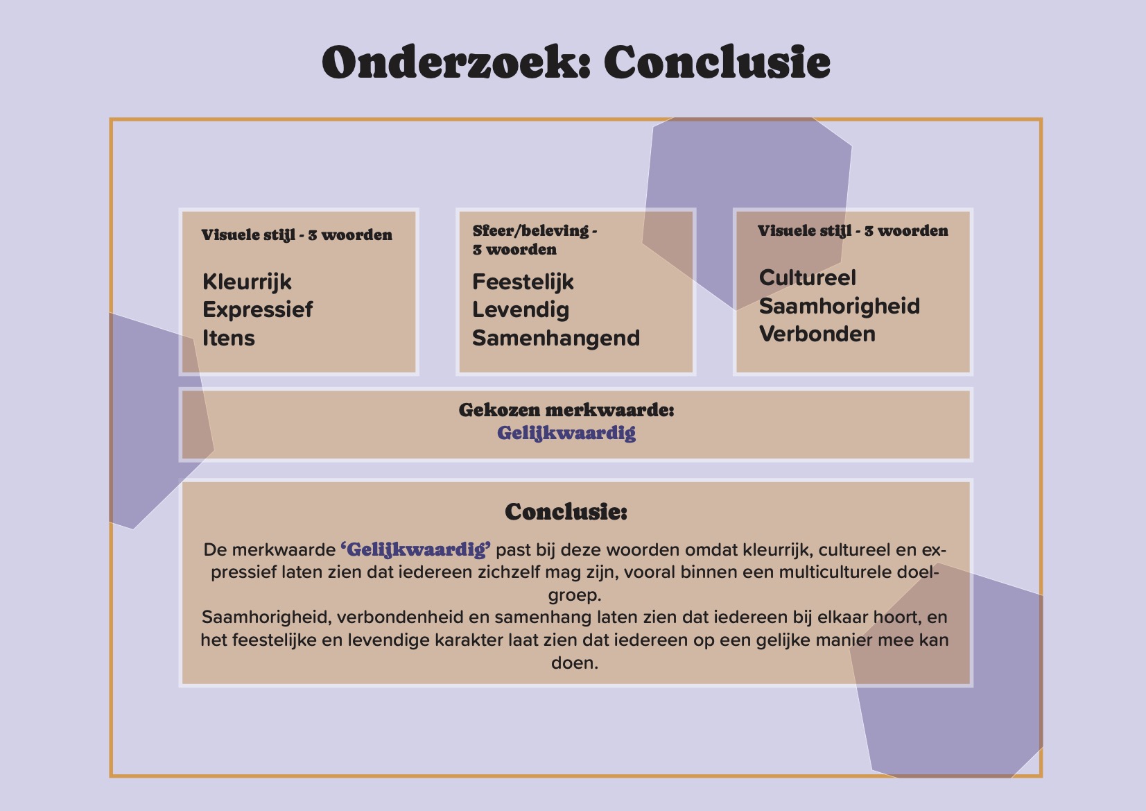
I answered a few questions about it’s visual style, atmosphere, and target audience. This helped me better understand what the festival stands for and made it easier to create a new design that fits its identity.

With that knowledge I chose the brand identity Equivalent.

Experimenting

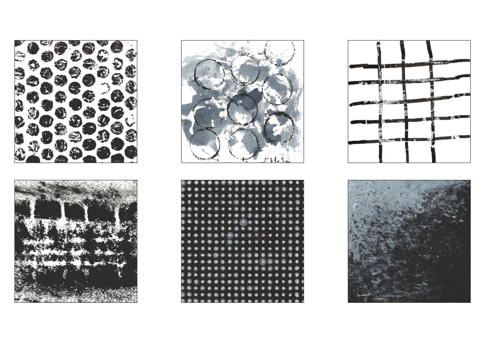
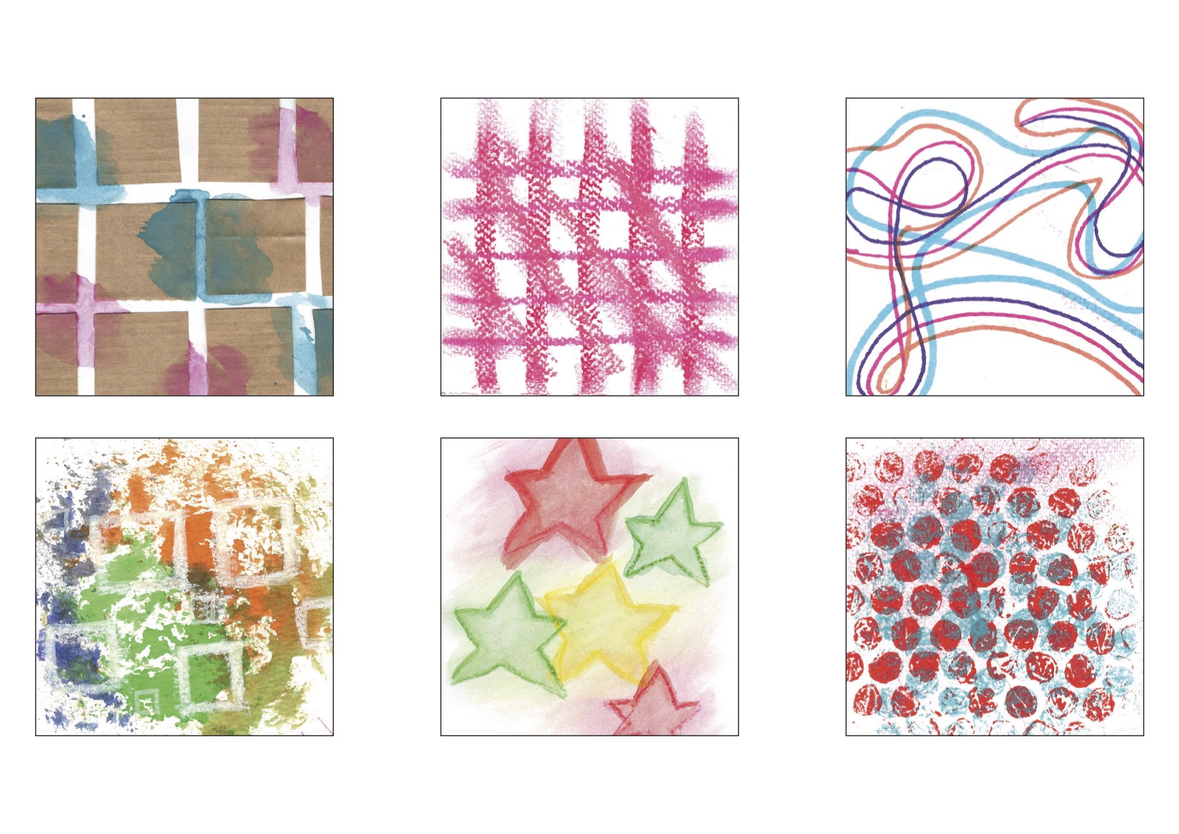
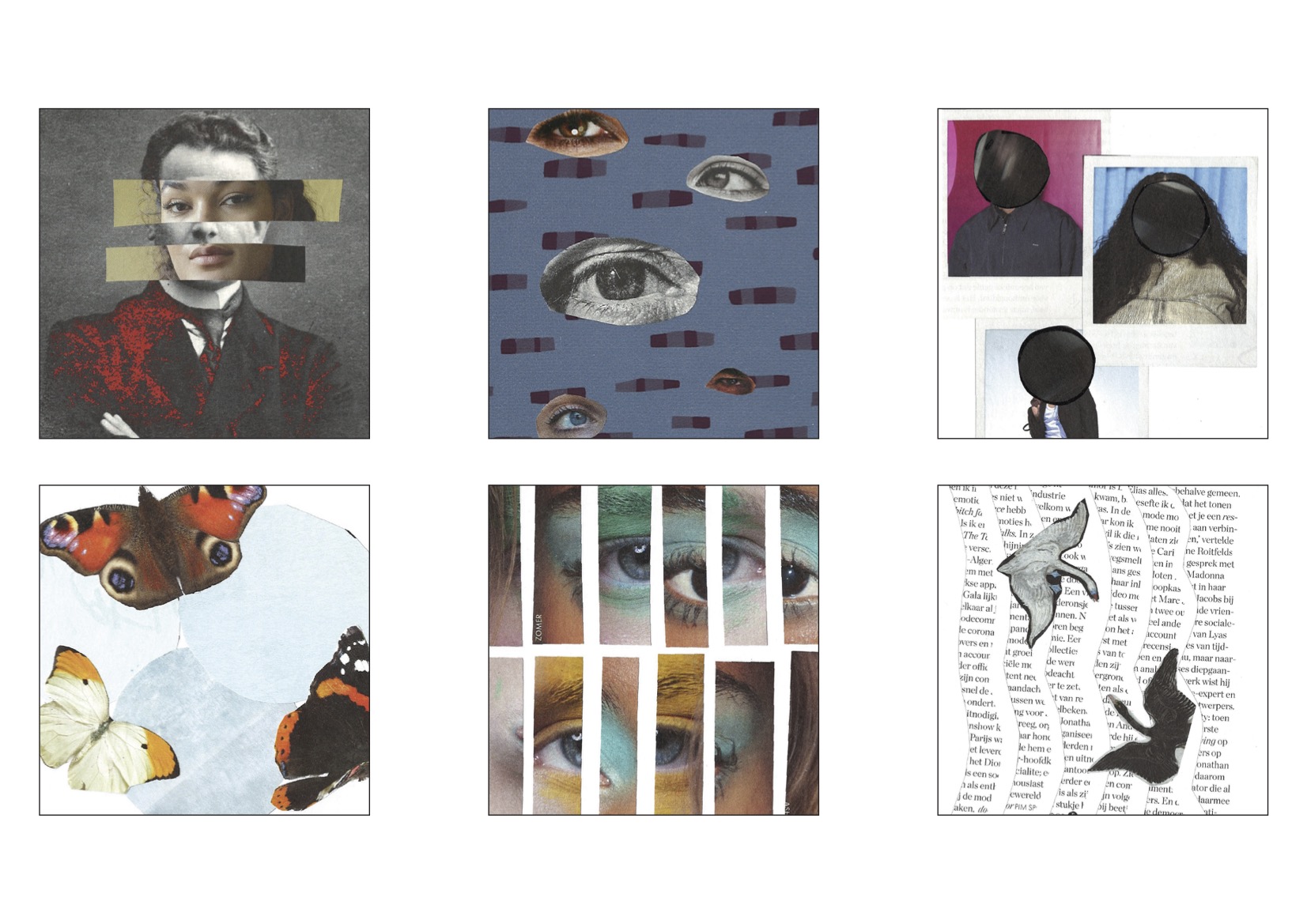
I started with making experiments with Equivalent in mind. I used a ton of different materials for this.

From Experiments to Design

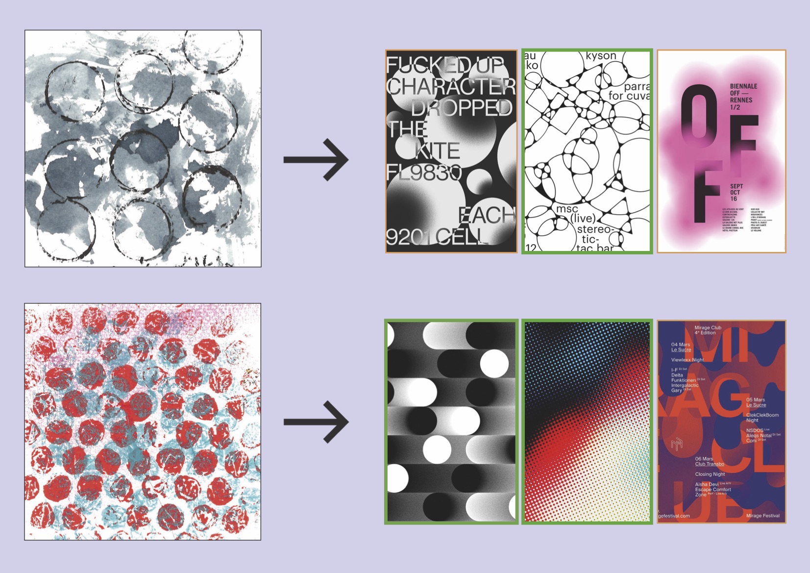
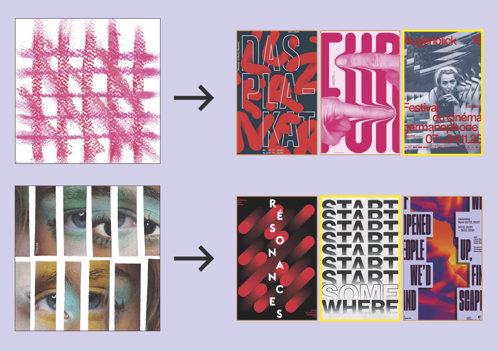
After completing my experiments, I selected two designs for each category and linked them to existing designs.

This helped me explore how the visual identity could look and feel.

Brand Identity

After linking my experiments to inspirational designs, I started working on the festival’s visual brand identity.

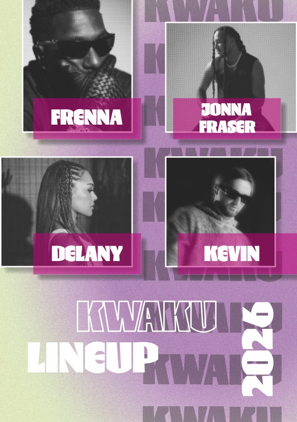
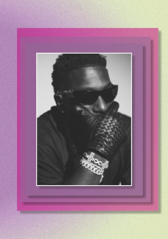
Here, you can see the final style I developed for the festival.

Festival Map

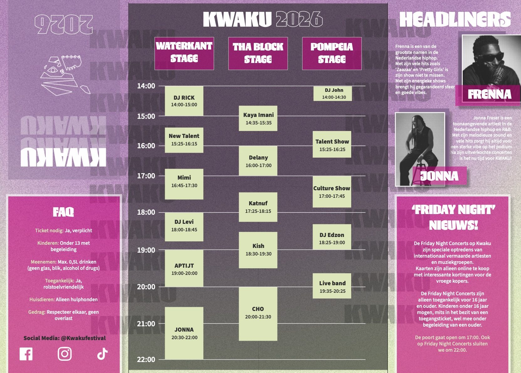
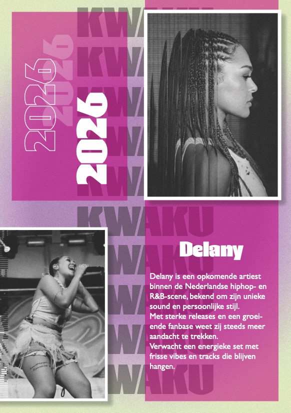
For this project, we had to create several design elements, including this fold-out brochure. It allows visitors to unfold it and read more information about the festival.

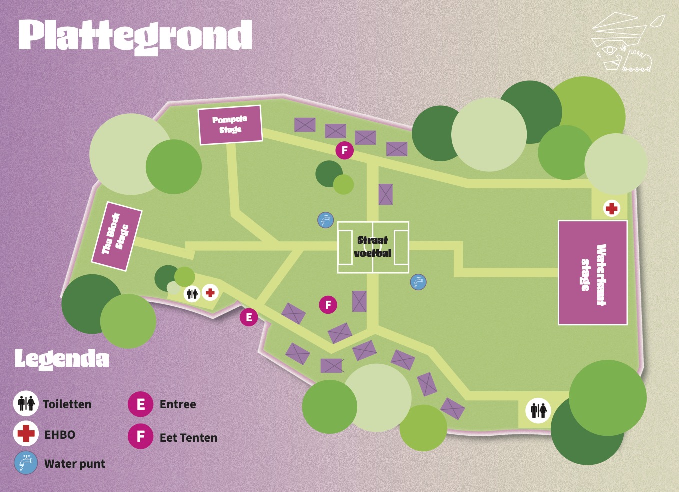
On the back, I also included a map to help visitors find their way around.