ONEWORLD Magazine

This is the first professional assignment of my second year at Media College. The assignment was to choose an article for the magazine OneWorld an create visuals for it.

You had to chose one article that you find the most interesting. I chose the article: ‘The Dark side of social media.’ I chose this article because it really resonated with me most. It discusses how social media can negatively impact young people, something many young people still experience today.

Brainstorming ideas

At the beginning of this project, we started by creating a mindmap.
We had to connect all the ideas from the article to a single word, using keywords.

Wordmark 'OneWorld'

For this project, I also had to design a magazine logo. We developed the logo through several iterations and interventions. This process eventually led to the final magazine logo. I am happy with the result, especially since I initially found it challenging to create a logo that matched the tone and style of my article and cover.

  • Illustrator

Cover

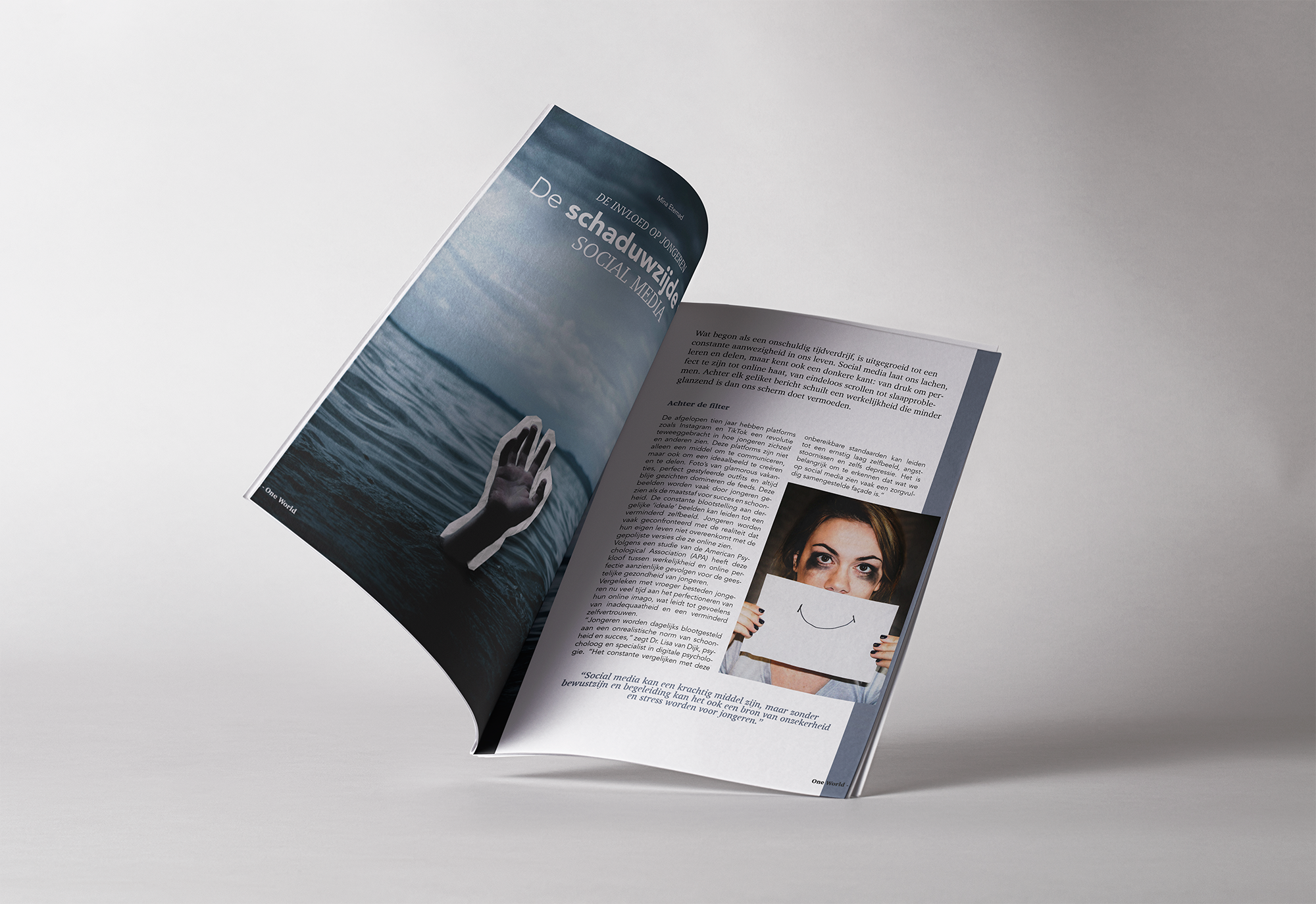
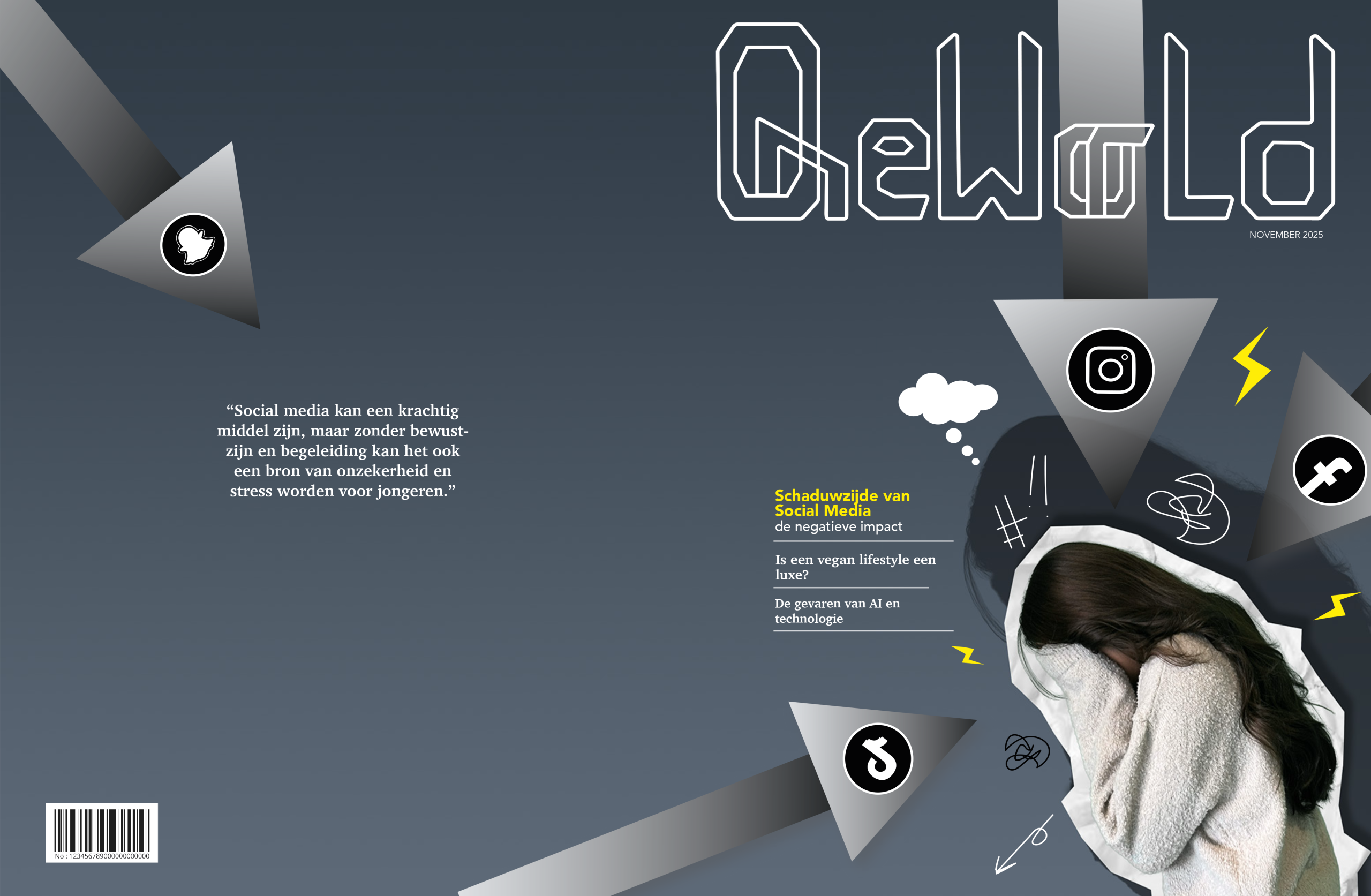
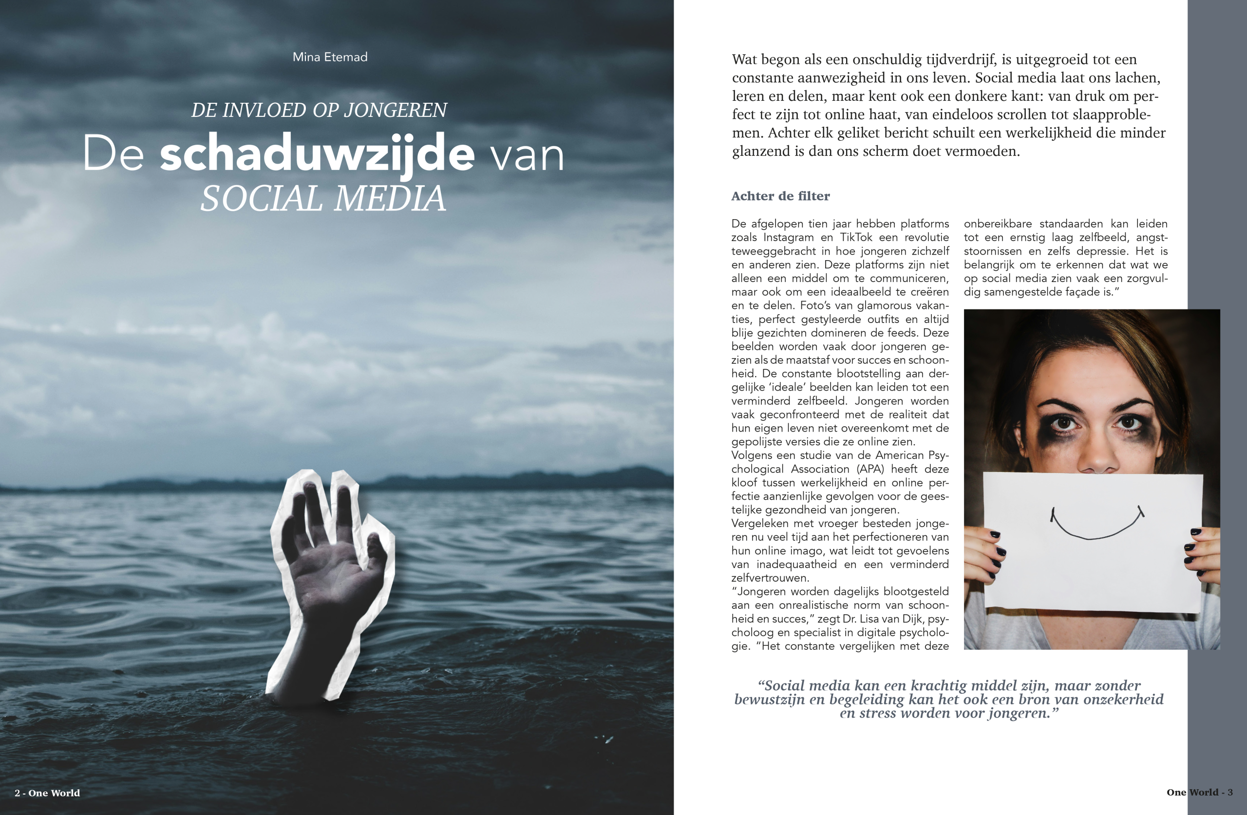
After completing the mind map research, we moved on to designing the cover of our magazine. This process started with a series of sketches. I first created seven small concept sketches and then selected one to develop into the final cover design. I chose the concept shown in the image.

To strengthen the cover, I decided to feature myself on it. Since the subject of my article is not a happy one, I chose to work with darker color tones. To create contrast and add visual impact, I included a pop of yellow.

I am very happy with how the design turned out, it closely matches the vision I had in mind.

  • Ilustrator/InDesign


Openings spread

This is the opening spread of my magazine. I wanted to create something that immediately draws attention when you look at the page. I also used the same color palette as the cover to keep the design consistent. I also added pictures to make the message stronger.


  • InDesign/Photoshop

Next spread

This is the spread following the opening spread. My main focus was on text placement. I also used the same colors and added new images to help communicate the message more clearly.


  • InDesign/Photoshop